Raven Studios
Making aerial arts & pole fitness accessible for all.
The Goal
Create a website & brand that promotes diversity, usability, and safety in regards to COVID-19.
My Role
Research / Wireframing / Brand Identity / Lead Designer / Marketing Designer / Photographer / Photo Editing
The Challenges
BODY IMAGE & STEREOTYPES
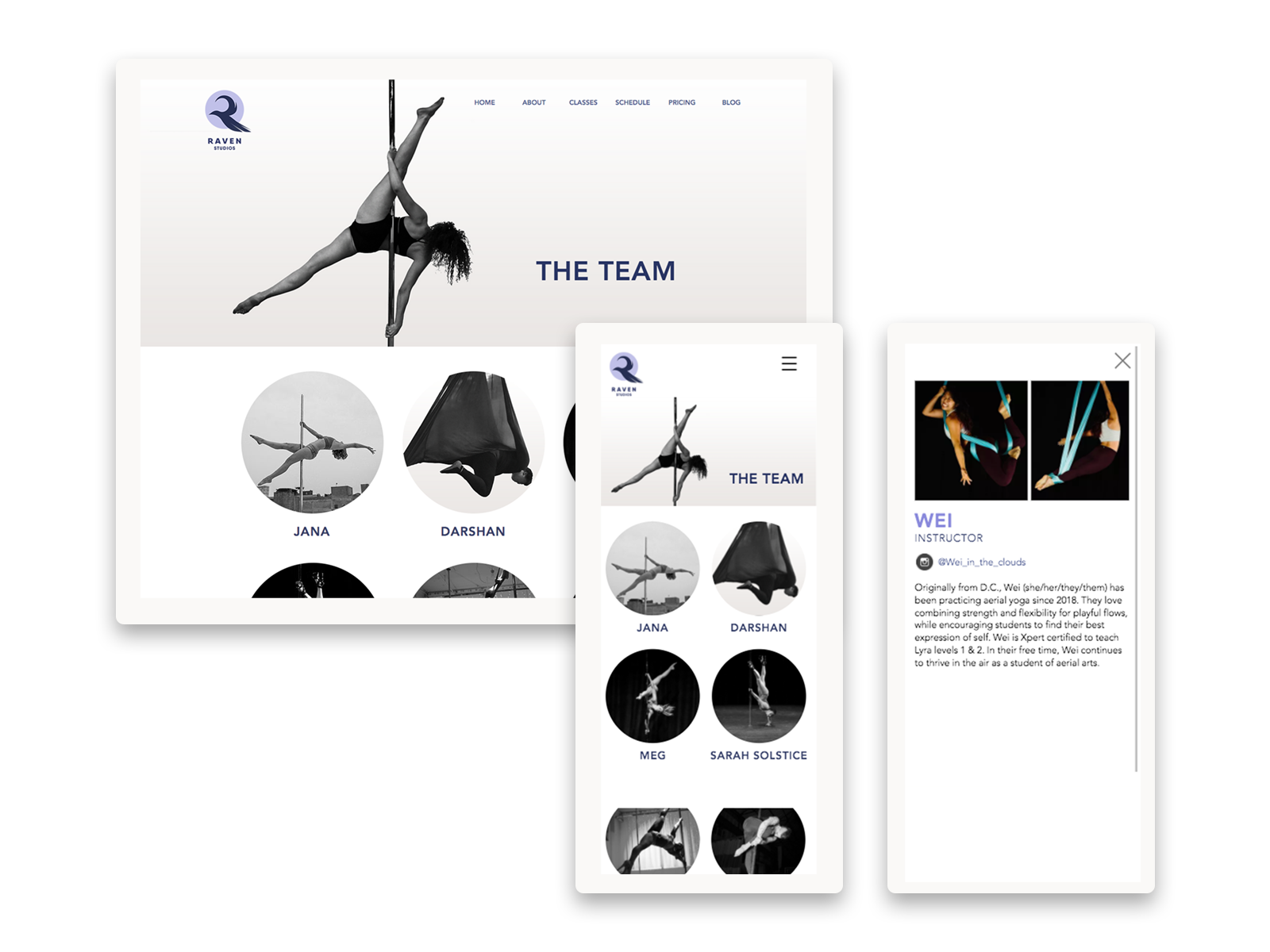
For safety, it's important to wear a tight-fitting and minimal amount of clothing while doing pole fitness and aerial arts. That can feel intimidating and scary to a lot of women—being constantly judged and body-shamed in media— it is important that the website and Raven brand represents people of all shapes, sizes, skin color and evokes the inclusive, judgment-free environment.
COVID-19
Opening a business during COVID-19 was a challenge. Since the pandemic, digital means of communication and getting information became vital. It was also a challenge to build a website and brand that was fundamentally built on the principles of community during a time of isolation. I worked with the team to harmoniously balance the serious safety concerns and measures of the studio while also standing by our message of inclusivity.
KEEPING IT SIMPLE
Having a wide range of different types of consumers can be difficult when tailoring a website. What a seasoned aerialist/pole dancer needs from a site is usually completely different than a new visitor. Keeping the site as streamlined as possible while also displaying all the options necessary was important to consider.
Business Goals
Pole and aerial arts is a very community-based activity and that was a huge aspect of customer acquisition and word-of-mouth marketing. We wanted to make sure that our product was easy to access and that the steps between discovery and purchase were as simple and clear as possible. Today, customers are skeptical, knowledgeable, and have bigger expectations than ever before. And one of those expectations is that businesses should care about more than just transactions.
Research
After solidifying our goals, I wanted a better understanding of what the current market was looking like and what the barriers would be to potential customers. Additionally, as a business that was opening its doors at the height of a pandemic, I wanted to understand how important transparency through our online user experience would be to the customer.
83% of people felt more safe going to a fitness facility if there were clear COVID-19 guidelines upon arrival to the website.
73% of people surveyed are intimidated about taking a pole or aerial class for self-image or body-conscious reasons.
The Personas
THE AVID AERIALIST
Motivations: Sarah is an avid hobby aerialist who is interested in scoping out the new studio in the city. Understanding what classes she can take as a transfer student are important to her.
Goals: Sarah wants to easily see the schedule and also if there are any new student deals. She also wants to be easily able to contact the studio in regards to being tested into a higher level as she is not a beginner.
Frustrations: Not being able to see an introductory deal or COVID-19 guidelines right away. Not being able to contact the studio or getting the studio information she needs easily.
THE TOTAL BEGINNER
Motivations: Molly is a mom who has been wanting to find an interesting and fun way to workout. Molly is a complete beginner and is pretty nervous about coming to the studio for the first time and wants to be as informed as possible before coming to her first class.
Goals: Molly wants to easily access all the informational pages such as the FAQ, policy page, or class description pages. She is also looking for a good introductory deal, and what classes she is able to sign up for as a total beginner.
Frustrations: Not having descriptive visuals and a clear path for getting more information. Not being able to explore the website easily and being overwhelmed. Not seeing people that look like her throughout the interface.
Competitor Analysis
Showing types of class offerings with descriptive visuals, as well as having clear call-to-action buttons for the user to further explore.
In regards to the navigation, having too many options was overwhelming and would lead to abandonment if the user can’t quickly find what they are looking for. Also having the navigation be visible upon arrival to the website (instead of toggling by clicking a button).
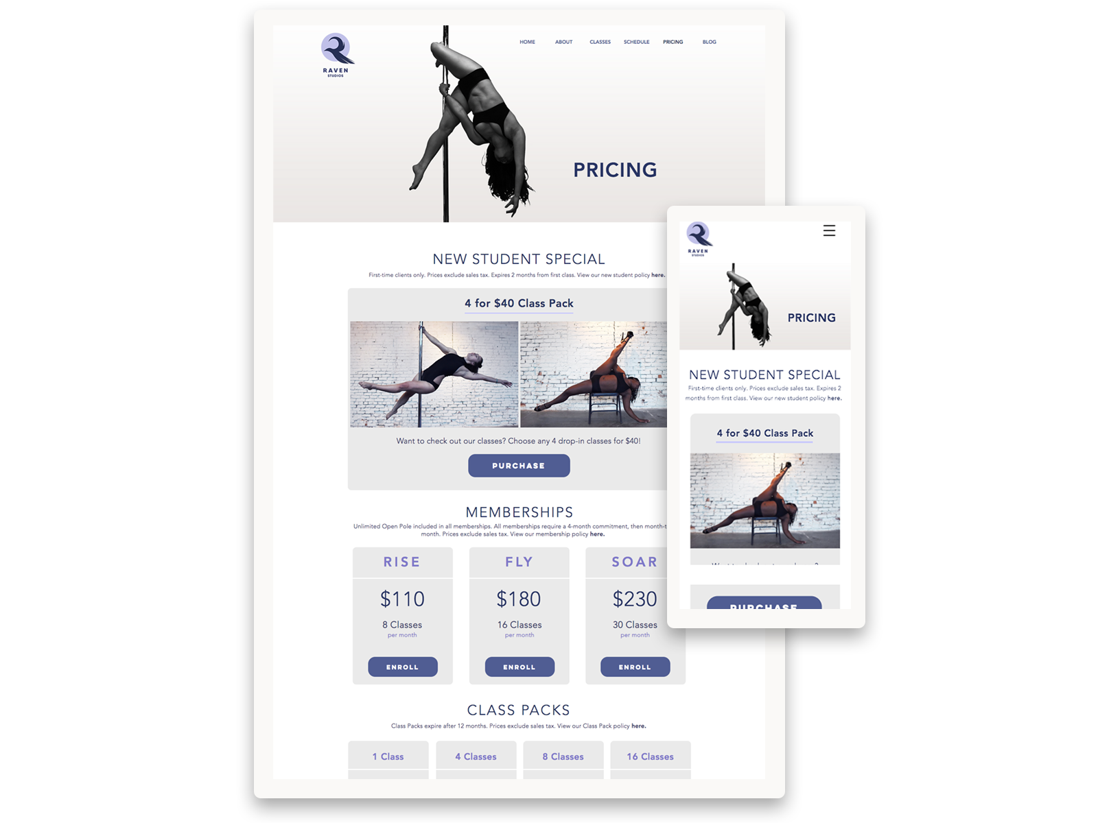
Since most studios either use Groupon, Classpass, or have an introductory deal, it was imperative that our deal was visible clearly on the home page so that we stay competitive.
The Sitemap
While creating the sitemap, it was important for me to handle the information architecture (IA) relating to the content that our personas would need. I wanted the home page to act as the shortcut/summary page for the most important aspects of our business, encouraging brand new visitors to keep exploring whilst providing information that seasoned dancers were looking for.
Wireframes
After creating the sitemap and information architecture, I quickly blocked all the elements out in Adobe XD. Knowing that I was using Wix, and because their editor works by adjusting the desktop design, I worked web-first rather than mobile-first in this case. I wanted to include big, dynamic images in the design to captivate and intrigue the user to want to continue exploring our site. The continuation of the use of the circular motif as branding throughout the UI elements, was important, as it represents community and is calming to the eye.
Testing
The wireframes were prototyped and tested with 15 people. Through their feedback I came to these conclusions and incorporated these changes moving into high-fidelity:
No images in class descriptions (the page was getting too long, hard to find the class you are looking for).
Policies all should all be listed out rather than collapsable tabs so it was easy to find information.
Making the COVID-19 guidelines/restrictions more visual because it was a chunk of text that many users did not read, which would affect the safety of our establishment. Also, many users just quickly wanted to see if we were incorporating a specific guideline, or a summary of current guidelines, as the situation was constantly evolving.
Phone & email should be moved to the top of the contact page rather than the bottom.
Having two intro deals was confusing, especially to newbies. Working with the marketing team, we decided to merge the two deals into one so there were fewer options for the user which could potentially lead to confusion and consequently abandonment.
Branding & Identity
Brand Name
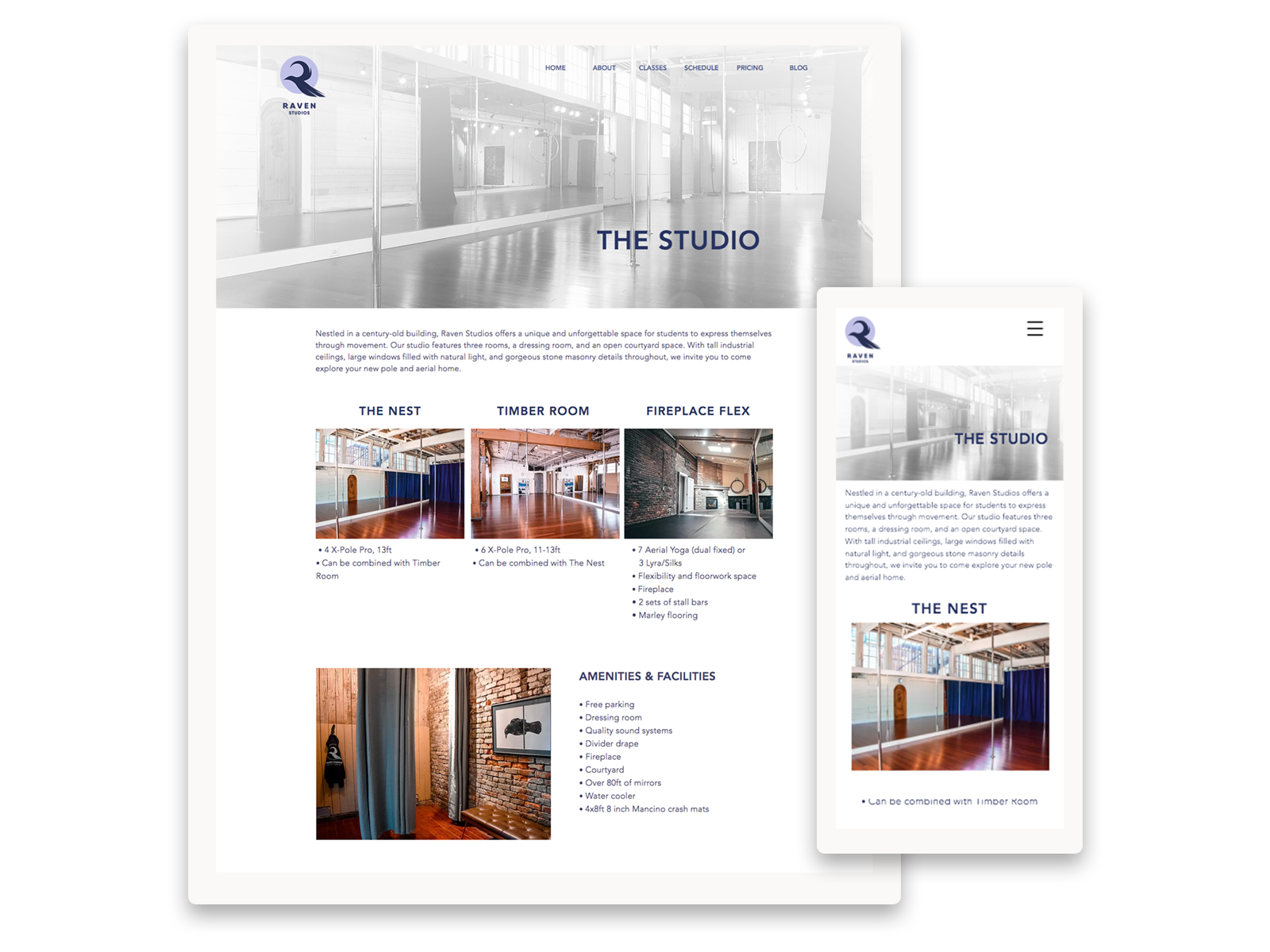
After discussions with the owner and the rest of the team, we wanted the studio name to incorporate a bird in our name, since it was memorable and relevant. We also felt that having a bird in the name would work well, as it wasn’t completely arbitrary but slightly suggestive of the flying nature of pole fitness and aerial arts. After going through many different types of bird names, we settled on Raven Studios, which accompanied the grunge-y, industrial, and slightly medieval vibe of the studio interior.
Logo
I began by exploring different shapes I could create with the R and with a raven silhouette. Eventually, I settled on combining them together. I was drawn to include a circle in my logo and within the branding, as it represents community, friendship and unity, which are all things tied into our mission statement.
Color & Typography
Next, I took the sketches and began transferring the ideas digitally, whilst continuing to explore the silhouettes and shapes. The typeface needed to represent the industrial aesthetic we were going for, but also stay looking clean and legible from small size. The font also needed to be not too intimidating or sharp. Since we wanted logo and branding to feel approachable, cooler, airy & pastel tones were more fitting. The navy was sleek whilst the lavender purple and light blues balanced out the design by adding a hint of playfulness and whimsicality.
Style Guide
After settling on option 2D from the concept sheet above, the logo & colors were polished and sub-marks & branding elements were created for the style guide.
High Fidelity Mockups

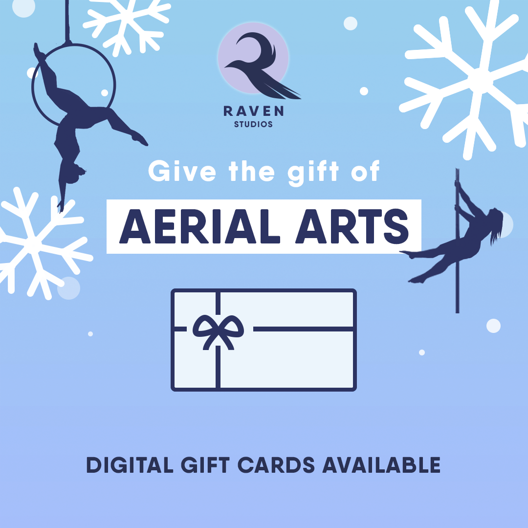
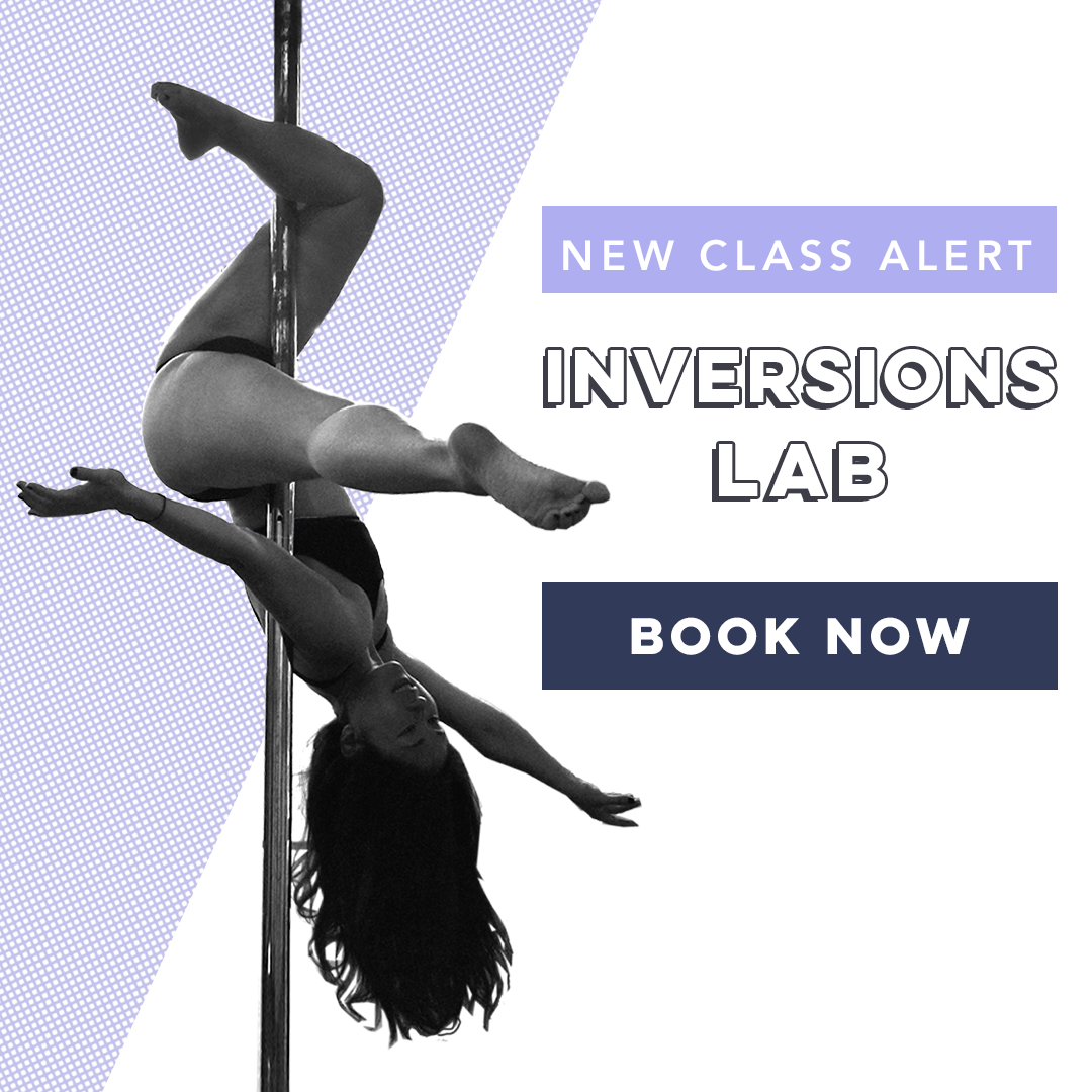
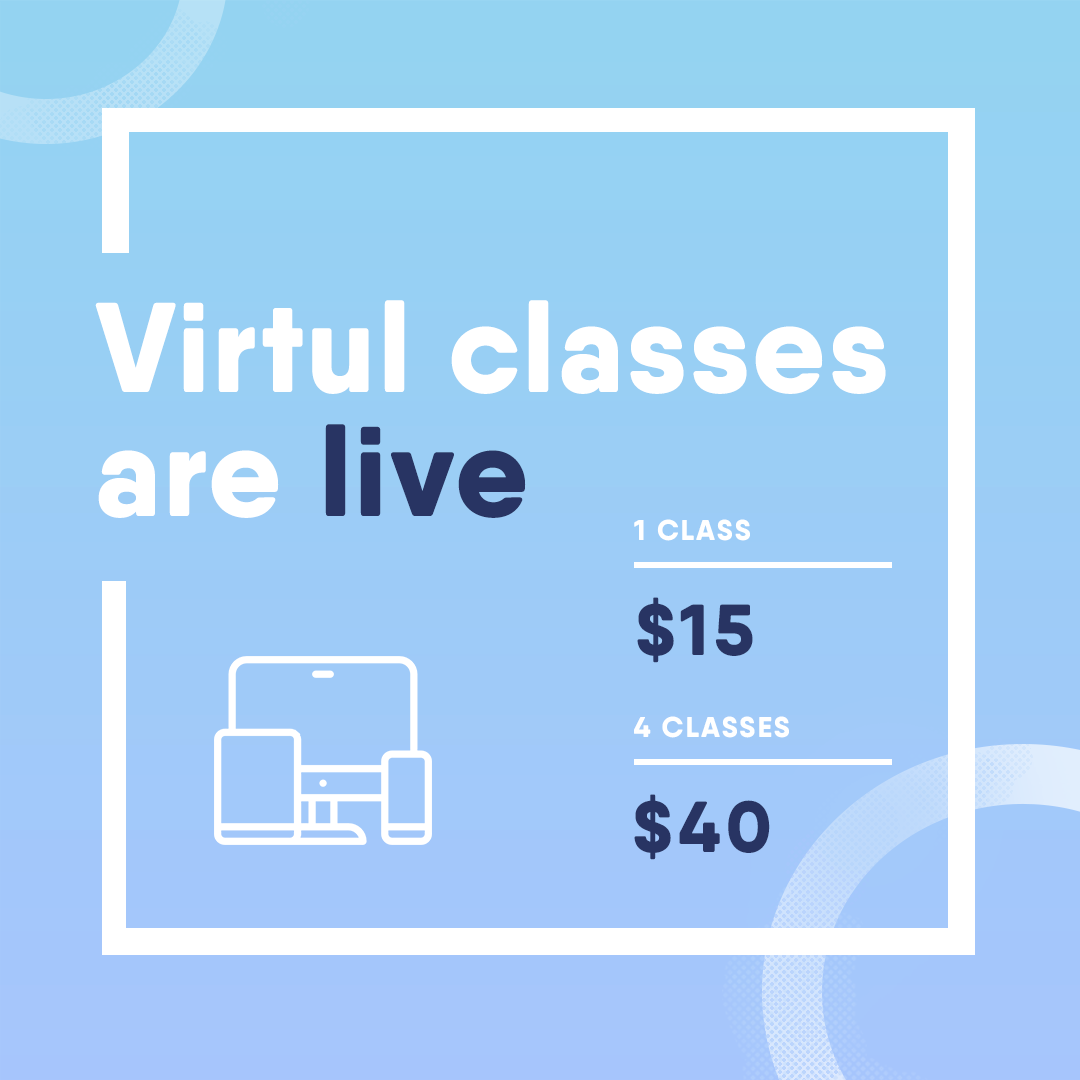
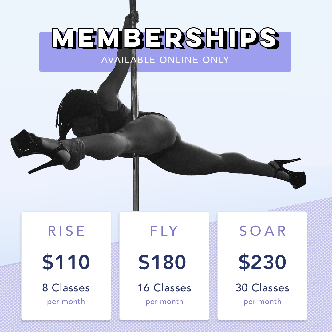
Marketing Material


Final thoughts
Through the research and design process, I was able to successfully create a brand and online experience for a brand new business during a very challenging and ever-adapting time. It was important to be flexible since I needed to quickly create content or to modify the website as COVID-19 guidelines changed alongside other business updates.
This project also taught me the importance of understanding how to create a clean, streamlined design that at the same time promoted diversity and community. Today, Raven Studios is one of the fastest-growing aerial arts & pole studios in the city.


